The Portfolio Edit: Pink
We’re tickled pink to celebrate Breast Cancer Awareness month on this week’s Portfolio Edit.
Pink Power
Think pink and your mind will no doubt jump to femininity – and you wouldn’t be wrong. Brands use it often and effectively in categories such as personal care, beauty and fashion. But it’s not all delicate and dainty any more. As women’s empowerment and gender equality continues to advance forward in our culture, the perception of pink has shifted. Now, pink can be strong. Pink can be powerful. Pink can be defiant. (Read this if you’re interested in learning how brands are responding to the Brave New Female)
When it is not used in a conventional way, pink is unexpected, shocking and disruptive. Pink pops, and when you’re trying to standout, it can be an asset. That might be why many modern brands use it their logos. Think AirBnB, Instagram and Vitality.
A Touch of Pink
Pink has also found its stride with high-end, luxury brands. As this category continues to be redefined, rich and opulent colours are out of fashion whilst shades like Millennial Pink are seen as understated, sophisticated and androgynous.
And finally, pink is obviously used in several food and drink brands representing a host of flavours – fruits like strawberry, raspberry and rhubarb or simply something sweet like biscuits, cakes and desserts. Pink is and always will be delicious.

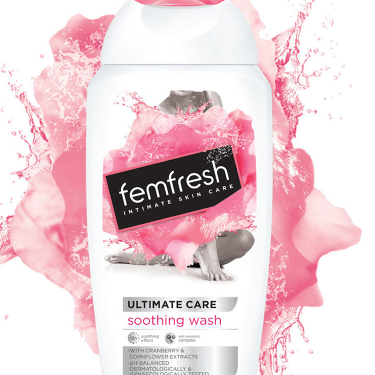
Femfresh Femininity is boldly unleashed with an expressive pink explosion for this taboo-breaking intimate skincare brand.

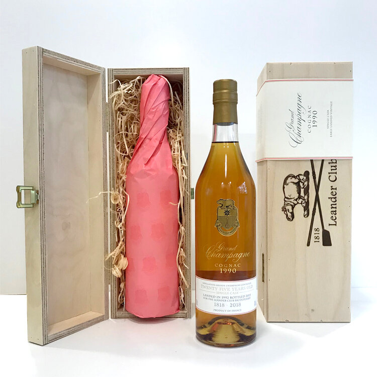
Leander Club The most successful Olympic sports club in the world has used pink since 1818. To celebrate their 200th anniversary, we designed a limited edition Champagne Cognac featuring bottles individually wrapped inn bespoke ‘pink’ tissue paper.

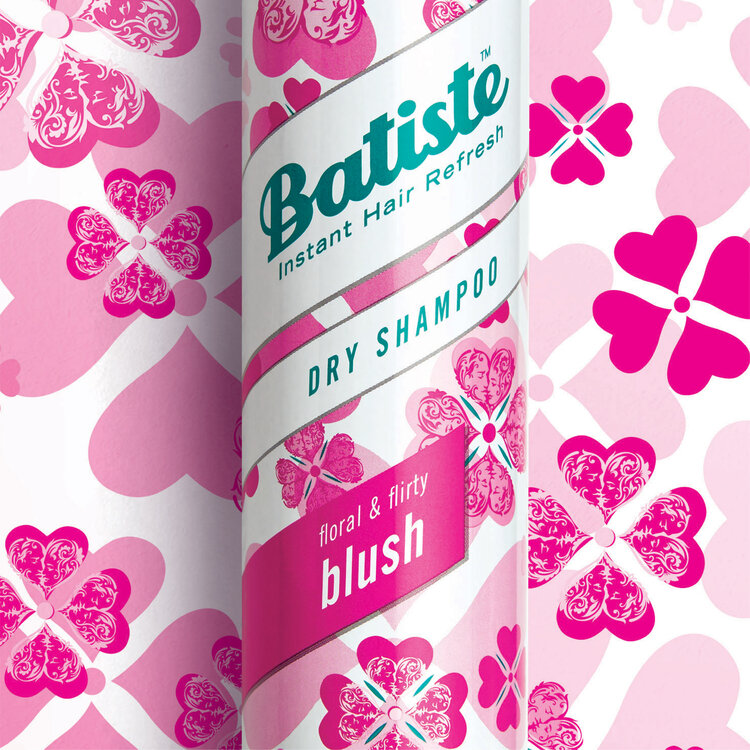
Batiste Pink is playful in this double-take design for the UK’s #1 dry shampoo brand.

Want to do more:
Whilst it’s a lot of fun to look into our archives for something pink, there’s more we can do for Breast Cancer Awareness. Like make a donation to Breast Cancer Now.
