Strength of character in the heart of the Mediterranean
Introducing the new face of Cisk beer! We’re proud to unveil the cohesive brand identity system our team has created for the Maltese stalwart brand.
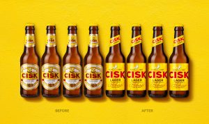
Cisk is a much-loved lager in Malta, it is owned by Simonds Farsons Cisk and at over 90 years old, it is steeped in the history and traditions of the island. Whilst the previous design reflected the heritage and legacy of the brand, a rejuvenating brand refresh was needed to maintain relevance and to connect with emerging consumer groups.

Capturing vibrancy and spontaneity
To get that warm, positive energy across, we drew on our positioning strategy first developed in 2019 to determine the creative direction for the brand’s evolution. We set out to define a cohesive brand identity system that would continue to build on its relevance to loyal patrons while reaching out to new markets and consumers.
Our lead brand designer on the project, Guy Robertson, said: “After immersive meetings at the impressive Farsons Brewery in Malta, it was clear we needed to harness the loud and proud spirit of the Mediterranean. We wanted to add a sense of unconstrained spontaneity, so we designed a progressive, fresh brand livery that speaks of Malta today.”

Redefining brand assets
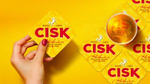
The Cisk word marque has been crafted for character, with the ‘C’ referencing a horseshoe and the ‘K’ the brand’s rearing stallion. That stallion, previously contained within a shield, has been redrawn and inverted to capture intrinsic brand strength and agility. And the instantly recognisable red-and-yellow colourway, for which Cisk is so well-known, comes alive with the new brand expression.

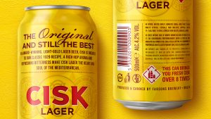
We also introduced a new faceted pattern based on the Maltese Cross that serves as a foundation for the whole brand and encapsulates pride in Cisk’s Maltese heritage. Subtle but at the heart of the brand’s DNA. The updated packaging reinforces the beer’s premium credentials, and the new identity will enhance Cisk’s presence and promise from instore to draught pump, from bottle to serving glass, from can to canopy.

Susan Weenink Camilleri, Head of Sales and Marketing at Simonds Farsons Cisk, said: “The modernised Cisk brand identity comprises many elements, working together to create something greater. The upgraded iconic assets will work beautifully in any environment – events, points of sale, communication touchpoints, still and animated campaigns. We have worked with bluemarlin since 2018 and have, over the years, established a level of trust that allows for open collaboration. By explaining the value of every change, bluemarlin has taken us on an enlightening brand journey with every project. We’re incredibly proud of what Cisk has achieved to date and equally excited about what the future holds.”
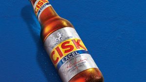
The flagship lager and low-carbohydrate Excel products have been given the new brand treatment, but it has been designed to work across all SKUs and future roll-outs.

Our founder and CEO Andrew Eyles said: “The new design system gives Simonds Farsons Cisk a robust and flexible structure that will continue to build brand equity now and in the future. It remains part of Maltese heritage, but with an eye firmly on the horizon. Having first worked on the 90th limited-edition livery for Cisk, and then produced outdoor and TVC activation, this has been a wonderful project that has taken us back into the brand archives and onto the full portfolio application, resulting in a stronger ‘brand house’ to accelerate Cisk’s growth.”
To learn more about this project please email andreweyles@bluemarlinbd.com

